"the problem is not bigger toolbar buttons, which are good for usability in many ways ... the real problem is that we cram so many (often stupid) things into our toolbars ...
"so when 'mail' appears in a painting program's toolbar (kolourpaint) one really ought to say themselves, 'wait a minute! this isn't an email program!"
I agree it could be solved by a more careful selection of toolbar actions. But the problem is that I didn't decide on the existing ones like "mail" - kdelibs did. The only ones I added were the zoom actions. Sure I could override the KDE defaults with noMerge="1" like I did with the "View" menu but this something that should really be solved on the kdelibs level.
Back to the question of which ones should go. Here's my personal preference:
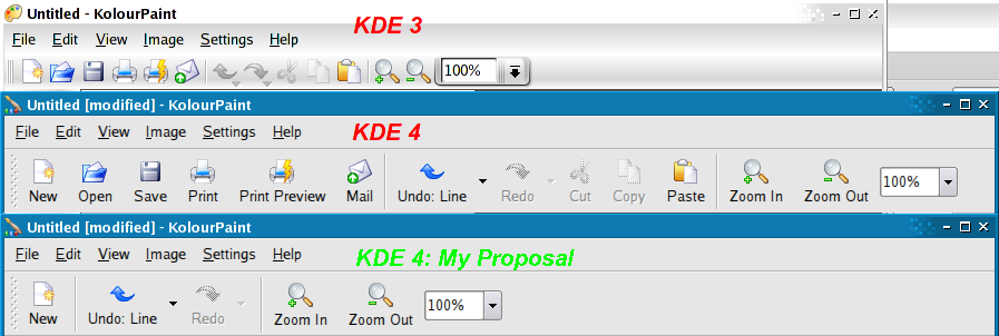
6 actions - measuring that up with "Text Under Icons", it's actually smaller than the KDE 3 KolourPaint with "Icons Only". This is great but how do I know that the majority of people agree with my personal opinion? I would fight tooth and nail to keep the undo/redo and zoom actions, at least, but maybe everyone else in the world really does email their doodles all the time?
I agree in principle with bigger icons but the text just adds to the visual clutter after one learns what the buttons are. If we have fewer buttons, won't tooltips be sufficient?
23 comments:
Personally, I think the text with icons is a good thing for new users, as it makes it far more intuitive, and your average computer user doesn't really understand the concept of tooltips, and until they are in every program for every function, it's not really possible to provide the accessibility that icons do.
I have no real problem with what the KDE defaults are, but, personally, I will have a problem if I'm forced to have text/not have text or have lots of/few icons.
The defaults should be set to be accessible to new users, as those using KDE for a while will feel a lot happier diving into KControl and turning these options on or off.
Got to say I'm with you on this one (the text + icons issue)Clarence - I'd like to see someone produce a mockup of kword with text under all the icons and tell me that having half your screen space occupied by the toolbars is really good usability (or are we to put things like bold an underline and fonts only in menus because people don't use them all the time?)
Coupled to that it looks ugly imho
I wonder whether creating a new document is more important than saving a document. I am not sure whether it is a good idea to abandon open and save icons.
anon: "I wonder whether creating a new document is more important than saving a document. I am not sure whether it is a good idea to abandon open and save icons."
I removed open/new actions from Kexi toolbar and users appear to be happy. These are not often used actions, especially in Kexi. Save action is often used OTOH.
I am concerned about "Undo: action" button because quite often these actions tend to consist of more than one word or just long one word. Imagine text "Undo: Font Formatting" under this one small button and also add "Redo: Paragraph Formatting" under the next one. That would effectively take up to one fifth of the screen width. What is even worse, the toolbar would be constantly changing its width because of the everchanging actions which in turn means that the toolbar buttons after Undo and Redo buttons would also be moving their locations as the user works with the program. My personal opinion would be to omit the action part of Undo and Redo toolbar button labels and leave it just like that - Undo and Redo with the action in the tooltip.
BTW, let's look how 'print preview' button wastes the horiz. space. Are we going to have word wrap enabled in kdeui by default? Moreover, look at undo/redo items. These are quite important actions yet have potential to be rather wide if an action is complex, e.g. "Unde: Fill using gradient" in a gfx app or "Undo: set Primary Key" in Kexi. You cannot shorten them (!)
Aaron?
Just to give my two cts
I agree with the idea that big icon with text is better in the general case.
But, I what that some special apps may have a different behavior : for example graphical apps : I need a lot of place for paint so I want small icons that don't waste room
So, in conclusion I want a possibility of icons size configuration by-apps (which could be hide behind a button "advanced options", that don't matter)
Regards,
O Oriol
Without text people never learn what many of the toolbuttons do. You can proof this yourself, open an app you don't often use and figure out what the butotns you've never used do.
The reason you don't use them is because you don't know what they do. It's a vicious cycle.
Also the icon difference between zoom in and out is minimal I find the text necessary.
The new icon is fairly similar to many other icons.
The only butons I feel text could be omitted from are universal ones like back, forward, undo, redo, stop and refresh.
But then we'd need a KDE policy where these icons are NEVER used with any other context. Which lets face it, will never happen with KDE.
Clearly the toolbar button should read Undo and the menu item "Undo: Your pants"
I don't think QAction supports this, but that is typical of Trolltech I have found, Qt is a fantastic toolkit that I use above everything else, but their UI components are not that advanced or complete.
I know you can hack KAction to do it, I did with one of my KDE 3 apps. And it made me realise what a bloody mess KAction is.
Well, I don't care what the default setting will be as long as it's still possible to change back to small icons without text. But if the default is text under the icons, an effort should be put into shortening the labels (in every language) and seriously reducing the number of icons. Screens aren't that extensible! Besides, I think that labels with a variable length (Undo: Something) are a very wrong idea. It will be distracting and probably annoying to see the icons dancing in the toolbars... and eventually the toolbars themselves bouncing from place to place to adopt a new width.
However, I also think that some space should be wasted to add a new default icon in the toolbar: Personalize. This possibility shouldn't be "hidden" behind a right click.
By the way, who decided to put "Zoom In" before "Zoom Out"? It looks like to be the new default in KDE. I can't help it but I find it strange. In every interface in the real world, the plus button is always on the right of the minus button. Look on your monitor, a remote control, a microwave oven, whatever.
maybe the zoom in/out can be enhanced by putting the - on left of the drop-down and the + on the right. no text needed, and more space efficient.
simon: I agree a word processor needs to keep a lot of icons on the toolbars esp. Bold and Italic. This is also the issue I face with the Tool Box.
About whether there should be a "New" button or a "Save" button, the choice of a "New" button reflects my personal bias - I always like to click to open a new window but CTRL+S to save. So how does one properly determine which is more popular? It looks like "Save" is winning at the moment though.
The changing size of the "Undo" action due to the text, I agree would get irritating. Someone did come up with a scheme where some buttons had text and others didn't (like IE in WinXP) but there was much debate and I don't think it ever got committed. I haven't heard about the "short text" option sorry but there was a slightly related "setCheckedState()" commit.
As for why the + sign is to the left of the - sign, I don't know. I guess it's just been that way. It feels more natural since I generally press + and never - and read from left-to-right? Not sure.
superstoned: I've found that that gets annoying if one is constantly changing zoom levels as they have to keep moving the mouse to reach the + then the -.
Time is money
dont waste your time to move the mouse pointer to the big save button.
You can work a lot faster (in general ) if you learn use more keyboard short-cuts.
like control-S for saving things. ( for me it's a reflex every 2 min. )
alt-tab to change window focus ( instead of moving to taskbar, see(k), click)
...
being able to do things without a toolbar/mouse is also usability. just unplug your mousse and try (may help you to prevent getting a mouse-arm)
Is there a tool that helps you to learn ( or remind you to use ) your 'favorite actions'keyboard shortcuts.
i'm thinking af a paperclip-figure :-)
Why not mix both, tooltip and icon text?
I.e. as soon as you move your mouse over the icon bar the text for all icons fades in below the icons. Make an animation of the icon bar expanding downwards so the text becomes visible, you just need some visual cue where the smaller textless bar ends because as soon as the mouse leaves that space the icon bar shrinks back to its standard size.
This solves the problem with other languages where words are longer (because as the expansion is only temporary you can have it expand two lines), you can use larger text (most text-under-icons bars have either too much empty space or too small text), and a cleaner look as long as the design and animation of the expanding bit is nicely done.
Clarence Dang: "This is great but how do I know that the majority of people agree with my personal opinion? I would fight tooth and nail to keep the undo/redo and zoom actions, at least, but maybe everyone else in the world really does email their doodles all the time?"
The thing is you don't. And even if you were to find out what everyone else in the world does on average (through usability testing, questionnaires, and such) you still couldn't please the majority of us, because there's no individual out there who actually matches the average.
That's why making the GUI customisation capabilities of KDE easier to discover (by more or less showing the user that "Hey, you can actually customise the toolbars and all it takes is a few clicks"), easier to use and more flexible (through LiveUi, perhaps) is far more important than wondering which buttons should be on which toolbars.
Obviously usable defaults are extremely important as well, but if UI customisation can be made reachable or maybe even an everyday thing for the average user, the user experience will evolve into a whole new level.
Really guys, watching two computer illiterates work with my PCs I'm telling you, if you remove cut-copy-paste and other buttons from the toolbat this functionality will be lost for them.
Better don't get carried away with such "optimizations".
I posted some rough mockups of what I meant with more accessible and flexible GUI customisation to KDE-Look:
http://www.kde-look.org/content/show.php?content=42474
Clarence,
I really like your proposal for KDE 4. However, would you mind if I brought up a possible small improvement?
I have a feeling that in some cases, it might be useful to consider the use of composed widgets in the toolbar. For instance, do you think perhaps the 'zoom in' and 'zoom out' actions could be composed with the pulldown menu into a single widget? Which would look something like this, I suppose:
|+| <100%> |-|
Or something. :)
And by this awkward piece of ASCII art, I mean, making the zoom in and zoom out buttons 1) part of the general 'zoom' widget, and 2) no bigger than the pulldown menu itself. Also, the grouping would allow for the use of simpler icons such as a simple '+' and '-', I think, since the fact they apply to zooming would then be contextually implicit.
My reasoning is that this would make the zoom feature look more 'integrated', so to speak, more together; squarer, neater. It would also save space!
In fact, this widget could probably make it into kdelibs, because there's a lot of tools out there that have a zoom function.
Thanks for reading,
-- S.
Yep. I'd like to see this cleared up in a more unix-like (i.e., connect-the-dots-like) way. For instance, why not have the ability to drag an image window onto an email app's icon? Why not be able to drop emails into project management apps, and have it begin a new project, with the email's author attached in a variety of possible ways -- project sponsor, assigned worker, etc.? Drag and drop, and similar intuitive tools, could be used much more effectively I think. KDE already takes this a little further than some other desktops (try dragging a KDE color box to another color box for instance), but much more could be done.
Hello Clarence,
well I like your proposal. Indeed the actual toolbars are too crowed.
On the other side - i will miss the File save and File open icons on the toolbar proposal...
greetings,
Bela
Hi, I've got some 2cents, too =)
To make buttons usable, flash them if an
shortcut is used. On the other hand,
flash the shortcut, if you use a button.
Does not work with todays keyboards,
but a reserved region in the toolbar (that should be the same for all KDE4 apps) where usability help is displayed.
This region could be turned of by the computer-literate users. It should display in an pleasant way, which shortcuts are available. The display would fade away after a few seconds (depending on whether the mouse is in a regoin around it ... this might be good measure of user attention?)
Some standard buttons used all over KDE could be moved to the right side of the toolbar - like the odd mailto, or maybe even some tools (like backup this document, make an svn commit, do a spell check ... ) - These are very special cases and should be user configurable.
Then, when right-clicking on a toolbar button i personally would prefer 'remove this button' over 'configure toolbars ...' - from a user perspective i do not care much about which different toolbars exist and why they are there - this is essentialy an implementation detail.
And probably most important, one thing I _do_ like about KDE is that shortcuts are mostly equal for all applications. That is pressing Ctrl-Shift-F makes an app run in fullscreen. I feel aggravated if it is something random. (But then it's under 'settings' for kate and under 'view' for konqueror *g*)
Ahem. Back to the topic: When considering text under besides over or near buttons ... please keep in mind, that sometimes translations will provide a very long text - with more than 5 buttons the toolbar get's _really_ ugly. Especially if you've got some button you never use, cluttering up to 5-10% of screen real estate, this is a prime reason to turn of that (damn) text. It would be different if a _short_ text had been provided. "An 'Seitenbreite' einpassen" isn't really short (kpdf).
Then actions should be grouped visually.
I guess you already know, how OSX looks in this regard and it IS a quite nice solution.
Enough ... Klaus Blindert
"I agree in principle with bigger icons but the text just adds to the visual clutter after one learns what the buttons are."
You almost answer your own question, the important word ther is "after". The way I see it toolbars are primarily for beginners and to a lesser extent for those not using the keyboard. Advanced users are more likely to learn to use keyboard shortcuts for fast access to frequently used actions.
Given that most users do have screens larger than 640x480 I would be inclined to use just a little bit more of the toolbar. For beginners it would probably be useful to put back Copy, Cut, and Paste on the toolbar.
It would be very useful if applications could keep track of what items get used most often, it would realy help not only developers but user decide how best to customize their toolbar layout.
Your proposal looks good, thanks for telling us about it.
Really guys, watching two computer illiterates work with my PCs I'm telling you, if you remove cut-copy-paste and other buttons from the toolbat this functionality will be lost for them.
QFT.
I often watch people who use the computer often, but only because they have to (they treat it as an appliance, like a toaster, as opposed to someone like us, who enjoys using the computer). The toolbar is used far more frequently than a menu. Remove print from a toolbar and it "goes away."
With the old default small icons without text, I really didn't mind more icon "clutter." A toolbar with 4 icons takes up just as much space as one with 15, might as well toss it up there. If each takes up more room though.. ugh. Have to balance letting newbs know what each one does with exposing functionality they might not otherwise find. Best of luck.
Post a Comment