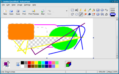
Thanks very much to everyone who commented on the proposal.
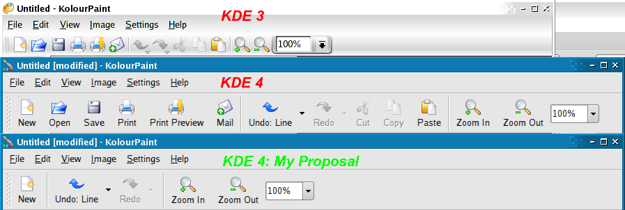
Recall that KolourPaint in KDE 3 looked like this:

New Proposal for KolourPaint / KDE 4
And now, based on your feedback, my latest proposal for KolourPaint in KDE 4 is:

Due to popular demand, I've added back the "Open" and "Save" buttons. I feel that just having a "Save" button as suggested is not sufficient for a paint app where one may open pictures often - this is different to a database app, like Kexi, where one usually manipulates just one DB.
As for concerns regarding removing buttons effectively hiding functionality from users less comfortable with computers, it is difficult to cater for a broad audience but I think overall, the new toolbar layout is more useful for more people since it's less cluttered and has bigger, easier to click buttons. It is of course configurable - this discussion is merely about the most popular defaults.
As you can see from above, I've also made fixed those Undo / Redo buttons so that they don't keep changing their labels (e.g. from "Undo: Text" to "Undo: Connected Lines") so that their sizes remain small (otherwise, think about the German translationa) and constant.
Also, thanks for some of the more creative ideas that were posed but unfortunately, I won't have time to implement them for now.
Dumping Text from the Zoom Actions
It was suggested that I dump the text from the zoom buttons (like KDE 3) to save space. I played with this but unfortunately, the smaller buttons are much harder to click:
So, large buttons with text it is.
Order of the Zoom Actions
But a remaining issue is the order of the zoom actions:
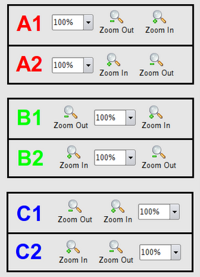
Which one is the best? Answer: I don't know.
B1 is used by KolourPaint in KDE 4 and Acrobat Reader. The ordering of the zoom actions is certainly more conventional but for some reason, seems clunkier.
B2 is used by okular. But the zoom actions look reversed. Yet, for some reason, the order feels more natural (I guess I zoom in "[+]" more often and as a left-to-right reader, it should come first?).
C2 is used by KolourPaint in KDE 3. The advantage of this scheme is that I frequently press [+] a few times until it's zoomed in enough and then I can just move the mouse a short distance to [-] to adjust. In contrast, this adjusting is made more difficult by the [+] and [-] buttons being far apart as in the cases of B1 and B2. So C2 is my favourite.
But I haven't really decided and in any case, this should be standardised across KDE apps so it would be great if you could vote for the one you prefer by adding a comment to this blog entry.
The final design will be chosen based on your votes so vote now!
