Thanks very much to everyone who commented on the proposal.
Recall that KolourPaint in KDE 3 looked like this:

New Proposal for KolourPaint / KDE 4
And now, based on your feedback, my latest proposal for KolourPaint in KDE 4 is:

Due to popular demand, I've added back the "Open" and "Save" buttons. I feel that just having a "Save" button as suggested is not sufficient for a paint app where one may open pictures often - this is different to a database app, like Kexi, where one usually manipulates just one DB.
As for concerns regarding removing buttons effectively hiding functionality from users less comfortable with computers, it is difficult to cater for a broad audience but I think overall, the new toolbar layout is more useful for more people since it's less cluttered and has bigger, easier to click buttons. It is of course configurable - this discussion is merely about the most popular defaults.
As you can see from above, I've also made fixed those Undo / Redo buttons so that they don't keep changing their labels (e.g. from "Undo: Text" to "Undo: Connected Lines") so that their sizes remain small (otherwise, think about the German translationa) and constant.
Also, thanks for some of the more creative ideas that were posed but unfortunately, I won't have time to implement them for now.
Dumping Text from the Zoom Actions
It was suggested that I dump the text from the zoom buttons (like KDE 3) to save space. I played with this but unfortunately, the smaller buttons are much harder to click:
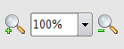
So, large buttons with text it is.
Order of the Zoom Actions
But a remaining issue is the order of the zoom actions:

Which one is the best? Answer: I don't know.
B1 is used by KolourPaint in KDE 4 and Acrobat Reader. The ordering of the zoom actions is certainly more conventional but for some reason, seems clunkier.
B2 is used by okular. But the zoom actions look reversed. Yet, for some reason, the order feels more natural (I guess I zoom in "[+]" more often and as a left-to-right reader, it should come first?).
C2 is used by KolourPaint in KDE 3. The advantage of this scheme is that I frequently press [+] a few times until it's zoomed in enough and then I can just move the mouse a short distance to [-] to adjust. In contrast, this adjusting is made more difficult by the [+] and [-] buttons being far apart as in the cases of B1 and B2. So C2 is my favourite.
But I haven't really decided and in any case, this should be standardised across KDE apps so it would be great if you could vote for the one you prefer by adding a comment to this blog entry.
The final design will be chosen based on your votes so vote now!
65 comments:
I vote for C2, A2 and B2, in that order.
Vote: B1 or B2, not one of the others.
But: ask also the usability guys!
c2, a2, c1, in that order.
B2
My favourite is C1.
B1
B1
Yes, ping the usability guys. A standard should be defined in the HIG and applied everywhere in KDE4. I've always been a B1 guy myself.
Why is there so much wasted vertical space above and below the icons in the toolbar? It appears to be a terrible waste of space. Is it just a theme issue that could be fixed up?
B1
That's the one I'm used to and the one I feel most comfortable using.
A bit of wet blanket, but I think the outcome of this poll is totally irrelevant, and you should follow the KDE usability guidelines on this one. And if those don't exists, they should be created.
I have my personal preference in this list, but I'll be able to live with any of them, possibly clicking the wrong button ten or twenty times, but eventually it'll become a routine.
What really becomes a pain in the neck is applications who do this "their own way" and reverse the order of the buttons for some reason. This means I need to read the text every single time, and cannot blindly click on e.g. the left part of something that looks like a zoom control group and expect it to do something I expect.
If you insist on making your own choices, that's fair, and I'd suggest you do whatever Okular will be doing, as this application will probably be used extensively in the new KDE desktop.
B2
I'd go with A1
B2
i'd go for b1 or b2, but i agree with the others here: let the usability guys talk and think about it...
C2
.
A2
Also, why is there so much padding above and below the icons/text?
B1.
B2,
Note1: despite the final election, it should be a standard for all KDE.
Note2: wouldn't it be better to ask it at openusability?
B2
B1, because I am really used to it. I guess it is used in some other applications.
C2 or A2.
Please don't go for any of the Bs. Your rationale against those two configurations is right.
B2, please
B2
Sorry for not voting but I had an alternative idea:
What about a slider, with a zoom-to-fit button?
Something like this:
( Z ) ---|-------
Where Z is the Zoom to fit button.
You could show the actual zoom size in either the title bar, a tooltip when moving over the slider or, if you've got enough room, in a widget on the right of the slider.
I vote for B1 but I'd rather have the usability guideline team decide this.
B2
I also think this *must* be consistent across kde so this is not the place to decide, but not sure where is...
Having said that ;-) my initial thought was b1/b2, but given the convenience of having + and - next to each other I think c1/c2 is best
(sorta)offtopic - if we have text under the icons then why not under the dropdown list - I mean what does that 100% mean? (Really, my point is that text under icons sucks)
B2. I fully agree with you that it feels more natural. In any paint program, zoom in is always the default action if you click on the zoom tool.
That said, any of the other options that put Zoom In to the left of Zoom Out are also fine.
B1.
I'd also like it if the + and - symbols on the icons stand up more.
C2 for president
If you look at compact cameras I think they are pretty consistent in that left is wide-angle (zooming out) and right is zooming in. I think that favours the alternatives with "unzoom" on the left and zoom on the right.
If you drop the text (doesn't matter as long as I can do it myself) having the dropdown in the middle helps separate the buttons.
And hear, hear to the statement that this must be consistent across applications.
Another idea to make your life more difficult: how about a KDE "experience level" which determines which default toolbar you get? Fewer icons with text when you are a novice, and more icons when you are an expert. User-friendly and developer-hostile as always :-)
Kjetil (a) Kilhavn in Norway
I choose B1, because it feels like an horizontal slider : lower values on the left, an greater on the right. Anyway, I agree that it should be made a standard in the HIG, and that usability group should be consulted.
Thanks for the poll !
C2. You zoom in before you zoom out.
C2.
in, out
left, right
up, down
yes, no
any other questions? :)
B2! It's the most usual layout IMHO. Any way, as long as you don't lock the icons in any position, nobody should complain.
I'd vote for B, where the number is determined by the locale (left-to-right or right-to-left). To me B2 feels the most natural in a Latin/European environment.
C2: you know you want to.
I really don't like B1 or B2, C2 is the best for me
Hello,
1) Leave out the current drop-down zoom level. The "zoom in" and the "zoom out" method suffices.
2) Do it in the gnome way. Not because it is better, but because a lot of people like to use gnome and kde application all together. Let not the same happen here as with the "OK" and "Cancel" buttons, that have an other order in gnome and kde.
I vote for slider, exactly as in image viewer apps.
I plan to use such slider even in Kexi to allow zooming the text or graphs(!) :)
I vote for B2. I think its the handiest and most intuitive one. but a slider also sounds nice ;)
i'd go for b2
I vote "anything is fine, as long as it's consistent in all KDE apps". With the slight preference for the B's.
B2 please.
Dear Clarence,
well I really like the addition of the open and save buttons to the toolbar.
For zooming...hmmm I'll prefer C2, as I'm used to it. Placing the dropdown inbetween the buttons sounds really logical on one side! but looks somewhat "nervous"...
greetings,
Bela
B2
B1
Same as seen on tv remotes (- +) and basic math plotting.
Dennis P
I say B2 or possibly A2
I am with HelloWorld82. The dropdown list should go out. People who needs text under icons doesn't care for the real zoom factor. I see it every day, if a normal user want to zoom very much just click + many times.
Then the normal and previsible order is -+ as in any other device (TV remote, cellular... etc or the monitor I have in front).
PD: draw the - and + signs bigger
B2, for consistency with Okular :P
thanks, Mister Fred, now I understand why I instictively went for b1.
but really, the vital thing is that it must be the *same* across ALL apps. I wanted to frigging strangle firefox when the ok/cancel buttons suddenly flipped around! I still only use that darn browser when konq completely fails me.
one of the 2's for me, dont realy mind which one, but I always think in up, then down. up being scale up, down being scale down.
for refrance:
*inkscape does it up, down, then spin box in another corner.
*firefox has incress then decress in the menu.
*gimp has zoom out, then zoom in
so... don't know! (although I still prefer zoom in to be on he left)
To me, B2 makes the most sense:
* it frames the dropdown so it is immediately clear that the dropdown is about zoom
* zoom IN is (between zout and zin) the FIRST action the user would look at, so most LTR countries would expect zoom IN to be on the LEFT
* it looks good!
B2
followed by C2
thx for good work
B1. But please follow the kde standard!
thanks a lot!
ben
C2 is my favorite
C2, definitely.
* The first thing people look for when they want to zoom in and out are the magnifying glasses, so they should be on the left.
* People usually open a picture, and the first occasion they want to use the zoom tool is when they want to have a closer look at something. So, the Zoom In (+) should be first.
* Often people press Zoom In multiple times, often one time too many, so they want to zoom out a step or two right after. so, Zoom Out should be right next to Zoom In.
* On occasion, people want to select a specific Zoom level, so add that to the right of the Zoom In / Out buttons.
* The Dropdown Zoom should include percentages (eg. 25, 50, 100, 125, 150, 175, 200, 300, 400, 600, 800%), and also "Selection" so it will fit whatever's selected to the view, and "All" or similar to zoom such that everything is visible.
Well, I like B1 and I'm sure others with science or engineering background will agree that it feels more natural (at least to people with that deal with Cartesian planes, left and down being negative, right and up being positive).
Have a good one.
B2 seems more natural for me
my vote is for C2
B2
I like the aesthetic symmetry of the B layouts.
In comes before Out, so it has to be B2.
My vote is B2
I vote for B1.
"Left" is always less and "right" is always "more", like in the X axis.
When you want to increase the music volume you turn the wheel from left to right, or move a bar to the right, never to the left.
It doesn't matter if the + button is more used than the - button. All the zoom box is a unique piece, and all of this should be easily accesible, but inside of it the left always means "minus".
Post a Comment